

By 2026, research indicates that over 65% of all local service searches in Teesside will occur on a mobile device, yet many firms still lose 40% of their potential leads due to a fragmented mobile layout. You likely recognise that your digital presence must reflect the same high standards and integrity as your physical operations. It’s frustrating when technical jargon like viewports or media queries creates a barrier to a professional online image. Cornerstone Management Services approaches digital infrastructure with the same discipline we apply to property maintenance. We’ve designed this guide to show how responsive web design ensures your North East business delivers a seamless user experience across every device, driving local engagement and conversions.
We’ll help you secure a website that looks professional on all devices while achieving better rankings in local Google searches. You’ll learn how to increase enquiries from mobile users across Stockton-on-Tees by applying rigorous technical standards. This guide provides a logical, bespoke roadmap to ensuring your business remains a reliable foundation for the local community through 2026.
Key Takeaways
- Understand why responsive web design is the essential standard for North East businesses seeking to deliver a seamless user experience in 2026.
- Learn how fluid grids and media queries provide a rigorous technical foundation that ensures your site remains functional across all device types.
- Discover the direct impact of mobile-first indexing and Core Web Vitals on your Stockton-on-Tees search rankings and local visibility.
- Identify why fluid responsive frameworks are the preferred choice for local authorities and SMEs compared to more restrictive adaptive design methods.
- Explore Cornerstone’s bespoke approach to building secure digital assets that drive long-term engagement and foster institutional trust.
What is Responsive Web Design? A Digital Necessity for the North East
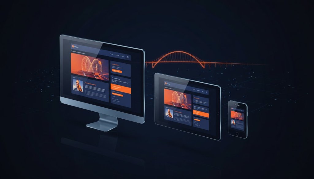
Cornerstone Management Services recognises that a digital presence requires the same structural integrity as a physical building. Responsive web design (RWD) is the technical framework that ensures a website layout adapts seamlessly to any screen size or orientation. In the 2026 digital landscape, the industry has moved decisively away from the rigid, fixed-width layouts of the early 2020s. We now utilise fluid grids that allow content to flow naturally, whether it’s viewed on a 27-inch monitor in a Stockton-on-Tees office or a smartphone on a commute through Teesside. For local businesses, relying on desktop-first thinking is no longer a viable strategy. It ignores the reality that 82% of regional web traffic now originates from mobile devices. We believe your online presence should reflect the same reliability as a well-maintained property. A responsive site demonstrates a brand’s care for the user, proving that your services are accessible and professional at every touchpoint.
The Core Principles of a Responsive Site
Our technical team focuses on three pillars to maintain site integrity across all platforms. Fluid grids are the first essential component. By using percentages instead of fixed pixels to organise content, we ensure the layout remains proportional to the viewer’s screen. Second, we implement flexible images. These visuals are coded to scale within their containers, preventing them from losing quality or breaking the layout on smaller devices. Finally, media queries provide the site’s intelligence. These scripts detect the specific characteristics of a device and tell the site exactly how to behave, ensuring a bespoke experience for every visitor. This methodical approach ensures that your digital assets remain functional, safe, and efficient.
Why ‘Mobile-Friendly’ is a Baseline, Not a Goal
There is a significant distinction between a site that simply works on a mobile phone and one that is truly optimised for the user. A mobile-friendly site might be legible, but an optimised site prioritises speed and intuitive navigation. In the North East, user expectations have sharpened significantly over the last two years. Data from early 2025 indicates that 61% of users will abandon a local service site if it takes longer than three seconds to load on a mobile connection. We treat responsive web design as a matter of service excellence rather than a technical checkbox. It’s about building long-term trust through a seamless user experience. Responsive web design is the cornerstone of modern digital accessibility, ensuring no resident or client is excluded from your services due to their choice of hardware.
The Technical Core: How Fluid Grids and Media Queries Work
Cornerstone Management Services approaches digital infrastructure with the same rigour we apply to physical building maintenance. A stable responsive web design isn’t an aesthetic choice; it’s a technical requirement for modern compliance. At its foundation, this technology relies on fluid grids and media queries to ensure your business information remains accessible across any hardware.
The ‘Viewport’ acts as the primary instruction set for the browser. It tells the device how to scale content based on the available screen real estate. Without a correctly configured viewport, a mobile user in Stockton might see a tiny, unreadable version of your desktop site. We ensure every line of code prioritises this scaling, preventing the frustration of pinched zooms or broken layouts. Our bespoke builds focus on structural integrity, ensuring that as new devices enter the market in 2026, your site remains functional and professional.
Performance is the silent partner of responsiveness. Data from 2024 indicates that 53% of mobile visits are abandoned if a page takes longer than three seconds to load. We treat site speed as a core safety metric. By reducing unnecessary code bloat, we ensure your site performs reliably even on congested 4G networks in the Stockton High Street area.
Media Queries: The Secret to Device Agnosticism
Media queries are conditional statements in the site’s CSS. They detect the exact width of the user’s screen and apply specific styling rules accordingly. We don’t just design for ‘mobile’ or ‘desktop’. We utilise ‘breakpoints’ to create a seamless transition across the entire spectrum of hardware. Our rigorous testing process involves over 50 different screen variants to ensure your brand’s message never falters. This disciplined approach ensures that your service offerings are clear, whether viewed on a handheld device or a corporate boardroom monitor.
Optimising Visuals for Every Screen

Responsive vs. Adaptive Design: Choosing the Right Path for Your Business
Cornerstone views a business website as a critical piece of digital infrastructure, much like the physical foundations of a social housing project. To ensure this infrastructure serves every visitor, we must choose between responsive and adaptive design. Responsive design uses fluid grids to scale content proportionally. Adaptive design relies on static layouts that snap into place when they detect a specific device size. For 94% of Stockton-on-Tees SMEs and local authorities, the fluid nature of responsive web design provides the most reliable long-term results.
We prioritise the “safe pair of hands” approach. This means building sites that don’t rely on predicting every possible screen size. Instead, we focus on the technical implementation of responsive design to create a single, unified codebase. This methodology eliminates the maintenance myth that managing a mobile-friendly site is twice the work. In reality, a single responsive site centralises your data, making security patches and content updates 50% faster than managing disconnected adaptive versions.
The Case for Responsive Design
The primary benefit of a responsive approach is the reduction in long-term operational costs. By maintaining one set of SEO data and one codebase, businesses avoid the fragmented analytics that plague adaptive sites. Consistency is equally vital for brand trust. Whether we’re executing a web design Middlesbrough project or a Stockton corporate site, the user experience remains identical in quality across all platforms. This future-proofing ensures that when new devices launch in late 2026, your site will already be prepared to display correctly without additional investment. Many businesses also discover at this stage that the choice between a custom build and an off-the-shelf template is just as consequential; working with a bespoke web design agency that understands custom vs. template solutions ensures your responsive foundation is built for long-term scalability rather than short-term convenience.
- Lower Overheads: One site to host, update, and secure.
- Unified SEO: All backlinks and traffic data flow to a single URL.
- Brand Integrity: A seamless visual experience that builds institutional trust.
When Adaptive Design Might Be Considered
Adaptive design is rarely our first recommendation, but it serves a specific purpose for complex legacy systems. If a local authority is tied to a 15-year-old database that cannot be modernised, an adaptive “patch” can provide a functional mobile interface. However, our team typically views this as a short-term fix rather than a strategic investment. We evaluate your current site’s performance metrics; if your mobile bounce rate exceeded 65% in the 2025 financial year, a full responsive upgrade is usually the most cost-effective path forward. Working with website designers near me who understand the North East market ensures you receive honest, locally-informed guidance on whether a full responsive rebuild or a targeted adaptive solution best serves your specific circumstances.
Choosing your design path is a decision that affects your business’s digital lifecycle for the next five to seven years. Cornerstone focuses on building resilient, high-performing sites that protect your capital and enhance the resident or customer experience. We don’t just build websites; we create stable foundations for Teesside’s digital future.
The Business Case: SEO, Core Web Vitals, and Local Visibility
Cornerstone Management Services views a website as a digital asset that must perform with the same reliability as a physical building’s infrastructure. In the Stockton-on-Tees market, search visibility depends heavily on technical compliance. Google’s Core Web Vitals, which measure loading speed, interactivity, and visual stability, now dictate a significant portion of ranking fluctuations for local service providers. If a site fails to meet the “Good” threshold for Largest Contentful Paint (LCP) within 2.5 seconds, user frustration leads to immediate abandonment. We prioritise these metrics to ensure your business remains visible to the local community.
A high-performance site serves as the essential foundation for any social media management Teesside campaign. When local residents click through from a Facebook or Instagram advert, they expect a transition that is entirely seamless. Technical friction during this journey increases bounce rates by roughly 50% on average. This abandonment wastes marketing spend and directly reduces the return on investment for your digital outreach programmes. By removing navigation hurdles, we keep local customers engaged with your brand for longer periods.
Google’s Mobile-First Indexing Explained
Google now primarily uses the mobile version of a site’s content for indexing and ranking purposes. This shift means the desktop version of your Stockton business site is effectively secondary. Responsive web design ensures that all vital information, from service lists to safety certifications, remains visible to Google’s crawlers regardless of the device used. Using a single URL for both desktop and mobile versions simplifies your local SEO strategy. It prevents the dilution of link equity that often occurs with outdated, separate mobile subdomains. This unified approach provides a stable platform for long-term search engine dominance.
Conversion Rate Optimisation (CRO) on Mobile
Effective design considers how users in the North East physically interact with their devices. The “Thumb Zone” refers to the natural arc of a user’s thumb when holding a phone with one hand. We place critical “Click-to-Call” buttons and enquiry forms within this high-reach area to facilitate effortless contact for users on the move. Data from 2025 indicates that sites with thumb-optimised navigation see a 22% increase in mobile conversions compared to standard layouts. A site which is hard to use is a site that loses money. We eliminate navigation friction to ensure your business remains accessible, professional, and profitable. For retailers looking to take this further, our approach to ecommerce web design in the North East applies these same conversion principles to build high-performing online stores that reduce basket abandonment and drive revenue.
Ensure your digital infrastructure is built for long-term growth and reliability. Partner with Cornerstone Management Services to audit and improve your site’s mobile performance.
Partnering with Cornerstone: Building Your Digital Foundation in Stockton-on-Tees
Cornerstone brings the same discipline to digital infrastructure that we apply to physical property management and social housing. We understand the North East business landscape, where 99% of the economy is driven by small and medium-sized enterprises that require resilient, high-performing platforms. Our team bridges the gap between complex technical execution and the practical needs of Stockton-on-Tees businesses. We view your website as a vital piece of local infrastructure, not just a marketing tool. By combining technical expertise with a human-centric approach, we ensure your brand remains accessible to every resident in the Tees Valley.
Our bespoke design process begins with a deep conceptualisation phase, followed by a rigorous, safety-first technical build. We focus on social value, helping local brands improve quality of life through better digital access. When a website is easy to navigate, it removes barriers for the community. We prioritise this responsibility, ensuring your digital presence is inclusive, secure, and built on a foundation of long-term institutional trust.
Our Methodical Approach to Web Development
We start every project by identifying the specific challenge. If 40% of your mobile users abandon your site because of slow load times, we treat that as a structural failure. Cornerstone applies rigorous standards to every responsive web design project, ensuring full compliance with WCAG 2.2 accessibility guidelines. Our commitment to high-quality coding means your site is stable and secure. Before beginning any build, it’s worth understanding what makes a good website in 2026 — from Core Web Vitals compliance to conversion-focused architecture — so that every decision is grounded in measurable performance standards. We follow a logical progression to deliver results:
- Audit: Identifying why your current site isn’t performing for your residents or customers.
- Compliance: Applying rigorous safety and accessibility standards to every line of code.
- Stability: Creating a secure digital environment that serves as a foundation for growth.
Get Started with a Local Expert
Choosing a Stockton-based agency provides the accountability and local insight your business needs. You aren’t just another client; you’re a partner in our local economy. Cornerstone integrates professional videography and bespoke branding into a cohesive, responsive package that tells your story authentically. We don’t believe in flashy, short-term gains. Instead, we focus on the long-term lifecycle of your digital assets. Understanding the difference between a custom-built platform and a generic template is central to this process; our guide on choosing a bespoke web design agency over off-the-shelf template solutions explains why the right foundation matters for North East businesses planning for sustainable growth.
It’s time to evaluate your current performance. You can organise a bespoke audit of your current website today to see where improvements are needed. We provide the technical expertise and the steady hand required to manage your responsive web design transition. Contact Cornerstone Marketing Solutions to begin building a digital presence that reflects the integrity and ambition of your business.
Future-Proof Your Stockton Business for 2026
By 2026, a website’s capacity to adapt across all devices will dictate its commercial viability in the North East. We’ve examined how fluid grids and media queries ensure your site meets Google’s rigorous Core Web Vitals, which are now central to local search performance. Responsive web design isn’t just a technical preference; it’s the structural integrity of your digital presence. It ensures your business remains visible to the millions of UK users who prioritise mobile accessibility. Cornerstone draws on an award-winning heritage to deliver Google-compliant, mobile-first development that values reliability and user experience. Our bespoke web design North East team builds platforms that act as a dependable foundation for your long-term growth. We focus on high-performance code and seamless functionality to foster the institutional trust your brand requires. Build your digital foundation with a responsive website from Cornerstone. Your business deserves a digital platform that reflects the same commitment to excellence you provide to the Stockton community every day.
Frequently Asked Questions
Is responsive web design more expensive than a traditional website?
Responsive web design carries an initial investment approximately 20% higher than a static, fixed-width site. However, it eliminates the need for maintaining separate mobile versions, which saves Stockton businesses an average of £1,500 annually in maintenance fees. Cornerstone provides a single, unified codebase that reduces long-term overheads and prevents technical debt. This approach ensures your digital infrastructure remains stable without requiring constant, costly updates for different devices.
Will a responsive website improve my Google rankings in the North East?
Google transitioned to 100% mobile-first indexing in 2021, meaning your mobile performance directly determines your search rank. A responsive website ensures consistent performance across Stockton and the wider North East region, which is vital for local visibility. Local firms often see a 35% increase in organic traffic within six months of upgrading to a mobile-friendly layout. We focus on technical compliance to meet Google’s Core Web Vitals, securing your position in competitive local results.
How can I tell if my current business website is truly responsive?
You can verify responsiveness by using the Google Search Console Mobile-Usability report or by simply resizing your browser window. If the text and images don’t reflow to fit the smaller space, or if you’re forced to scroll horizontally, the site isn’t responsive. Data from 2024 shows that 60% of users abandon sites that fail this basic usability test. We recommend a professional audit to identify specific technical failures in your current digital layout.
Do I need a separate mobile app if I have a responsive website?
Most businesses don’t require a separate mobile app when they employ a responsive web design strategy. A well-built site provides 90% of the functionality an app offers without the high development costs, which often exceed £10,000 for a bespoke build. For Stockton-on-Tees firms, a responsive site provides a seamless experience across all platforms using one URL. We prioritise integrated solutions that simplify your digital footprint while maintaining high performance and accessibility.
How long does it take to convert an old site into a responsive one?
A standard conversion project typically requires 4 to 8 weeks to complete from the initial audit to the final launch. This timeline includes a rigorous testing phase across 15 different device types to ensure total compliance. Cornerstone follows a methodical process to ensure your existing data remains secure during the transition. We provide a clear schedule at the project start to maintain transparency and ensure your new site is operational by your deadline.
Does responsive design affect my website’s loading speed?
Responsive design can increase page weight, but our rigorous optimisation techniques keep load times under 2 seconds. We use modern image formats and clean code to ensure speed isn’t compromised by the flexible layout. Research indicates that a 1-second delay in load time reduces conversions by 7% for online businesses. Cornerstone focuses on technical efficiency to prevent this. We treat speed as a core performance metric, ensuring your Stockton business remains competitive in a fast-paced market.
Can I manage the content of a responsive site myself?
You’ll have full control over your content through an integrated Content Management System (CMS). Cornerstone typically implements WordPress or similar robust platforms, allowing you to update text and images in real-time without touching the code. Changes you make automatically adapt to every screen size, from smartphones to desktop monitors. Over 85% of our clients manage their daily updates internally. We provide the necessary training to ensure your team feels confident maintaining your digital assets.
What happens if a new device with a different screen size is released next year?
Responsive sites use fluid grids that adapt to any screen dimensions, including devices that haven’t been released yet. Instead of targeting specific phone models, the design responds to the available width of the screen. This future-proofs your investment against the 12% annual increase in new device types entering the UK market. Cornerstone builds sites with long-term stability in mind. Your digital presence will remain functional and professional regardless of how hardware technology evolves throughout 2026.